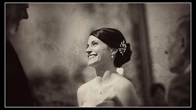
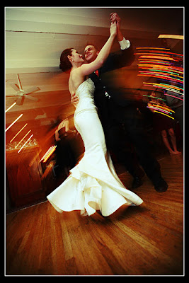
I decided to feature these duo-photographing professionals I came across who shot this beautiful wedding! Project Mad Love is a collaboration of two European born artists (go figure!), Monika Broz and David Mielcarek. According to their website they combine creativity with solid technical skill. A beautiful combination I hope to achieve some day :)
I admit I am biased because there were pieces of European classic/vintage looks, but most of all -- some photos were simply inspiring!
This was the wedding of Emily and Peter...


I admit I am biased because there were pieces of European classic/vintage looks, but most of all -- some photos were simply inspiring!
This was the wedding of Emily and Peter...

I know it's not many, but there wasn't many to begin with. I wanted to share at least a piece :)
Okay -- so you may remember my color scheme derived from this image:
Deep red, teal, dusty gray, ivory and dark brown.
Okay -- so you may remember my color scheme derived from this image:
Deep red, teal, dusty gray, ivory and dark brown.

I also made a color board using these colors -- I'm really proud of it, so here it is for your viewing pleasure (BTW -- I have firmly decided if I don't use a red flower in my hair, I WILL recreate the teal flower in this color board) -- CLICK on it to see it BIG!!! MUST SEE BIG TO APPRECIATE! :)
Here is my question to YOU all. I came across this inspiration board from my weekly dose of Snippet & Ink. Her inspiration was more of a beachy, "breezy" and "lazy" theme. However, I definitely picked up this delicate, vintage theme from this. Obviously there's teal -- and I'm not getting rid of teal in my color scheme (I'm obsessed w/the color), but this pale pink is suddenly jumping at me.
When I was in middle school I used to try so hard to say that I "hated" pink. I thought pink had such a bad rep and was always associated with wussy girls. Once I got to highschool, I had to face the facts -- I liked pink. Heck, I'm leaning towards "love" with the way pink can be agressive, delicate, sexy, and so much more. I REALLY enjoy the pair that teal and a pastel pink make. This theme is more... delicate, versus my inspiration board is -- energetic and a modern retro.
I don't know. See, red can add that Spanish splash that I want in my wedding. Again, the theme is: Spanish-European Vintage. On the other hand, the pastel pink adds delicacy and sophistication.
Blah. I think currently I'm still leaning towards red because I find that soft pink is very typical in weddings. I don't want mine to be typical (though still traditional :).
Your thoughts!?!?


I love those photographs - especially the ones with the lights looking all crazy! Also, I think pink is a beautiful color and it would look pretty with teal. But, I definitely prefer the teal and red color scheme. OH! And I love the teal flower :)
I think you should stick to teal and red. Although teal and pink is nice, it will change the whole point of Spanish red, which brings that extra oomph to the color palette. Plus, here are some incentives.. :)
http://cache.stylemepretty.com/wp-content/uploads/2008/11/real-wedding-3.jpg
http://1.bp.blogspot.com/_nS6YO7oiLb4/SYZmdsWCheI/AAAAAAAAJCM/sxR6i4lY1BA/s400/teal+and+red,+micheal+norwood+joyful+weddings.jpg
http://1.bp.blogspot.com/_nS6YO7oiLb4/SYZmdsWCheI/AAAAAAAAJCM/sxR6i4lY1BA/s400/teal+and+red,+micheal+norwood+joyful+weddings.jpg
http://cache.stylemepretty.com/wp-content/uploads/2008/11/real-wedding-3.jpg